
*again, sorry about the boring arial font but we had to choose something that would be easy to read from a distance on a wall.
media coursework portfolio
*again, sorry about the boring arial font but we had to choose something that would be easy to read from a distance on a wall.
Some old artwork I made for Alpha Generation on Undertale.


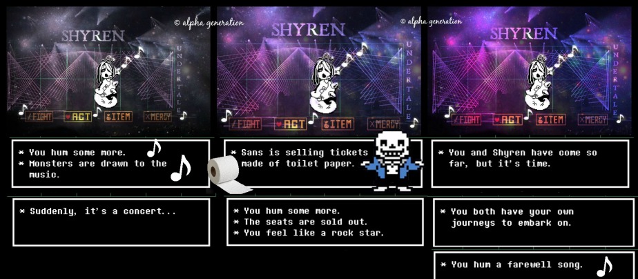
Made for an old Alpha Generation competition, thought I might as well upload both the versions here.


Woodcut
Definition: a print made from a block of wood which is widely used for illustrations in books.
Advantages: easy to find tutorials online. Anyone can do it if they have all the equipment. Saves money.
Disadvantages: does take time to improve, the first one you make won’t be perfect unless you learn from your mistakes. Making sure you have all the equipment and the right picture to copy. Doesn’t save time.
Gravure
Used to make wallpaper; packaging; giftwrap; magazines; greeting cards; advertising.
Advantages: wallpapers would be easier to produce because there is high volume printing. Saves the trouble of making your own. Have the perfect designs in the press of a button. Uses fast drying ink.
Disadvantages: may take time and money to find the perfect designs. Constantly checking if you have all the materials. Checking the quality is still the same in the size you need it.
Intaglio
Advantages: used for multiple productions: paper; plastic currency; banknotes; passports; expensive stamps; wedding invitations. Cheap. Calming. Very long plate life. High quality.
Disadvantages: high demand.
Letterpress
Advantages: easy to print and design what you want.
Disadvantages: expensive products would be needed to make it perfect.
Etching
Definition: the process of making designs on a metal plate which uses the corrosive action of an acid.
Advantages: still widely practised today. Many circuits can be etched at once, very quickly. All etchings can be identical.
Disadvantages: if the circuit needs to be updated, then it would have to be re-designed, re-etched from scratch. Etching can also be harmful to the environment.
Photocopying
Advantages: no sketching is needed, you can just have a copy of the original. Very easy to use. Saves time.
Disadvantages: people preferred to rely on longhand copies, still depends on you checking there is enough ink and paper. Doesn’t save money.
Lithography
Advantages: became easier, anyone can do it, easy to find tutorials online.
Disadvantages: need to have all the equipment. Time and money consuming. Finding somewhere to put finished work.
Screen print
Definition: putting ink or metal onto a surface through a prepared screen of materials which creates the picture or pattern.
Advantages: Easy to use, can make posters, merchandising or other packaging. Saves money.
Disadvantages: Takes practise to perfect, pictures have to be the right size to fit the designs. Not economically practical for small press runs.
Linocut
Definition: relief printing. A design is carved into a piece of linoleum which is then inked with brayer. The print is made by placing a sheet of paper on top, making the ink transfer to the paper.
Advantages: equipment became cheaper. There are classes to take to get better. Much easier to cut than wood.
Disadvantages: seen as easy. Not quite as durable as wood. Specific materials are needed. Anything you put on your linocut will be backwards when printed.
Laser printing
Advantages: easy to print out whatever you want on paper, doesn’t take too long to print. Very easy to use, you can have the same printer for years and it would still work.
Disadvantages: expensive, and you have to keep replacing the paper and ink. Keep an eye on the ink, as some pictures can take more ink than others.
Inkjet
Advantages: they are the evolution of the future, they’re cheap, ink isn’t wasted.
Disadvantages: they weren’t accepted into society until 1990. The printhead would become clogged with dried ink. Inkjets used to be expensive and they would waste ink until 1977.
Desktop publishing
Softwares to use: Photoshop; InDesign; PagePlus; Microsoft Publisher; SmartDraw; Xara Page; Print Artist; PrintMaster; Viva Designer
Advantages: very easy to do, with tutorials online, anyone can do it and there are a range of products for desktop publishing.
Disadvantages: the professional products to help make work better, like Photoshop are expensive. Can take up a lot of space on the computer. You may need a range of products to make a blog look how you want it to.
Bibliography
I was asked to do a double page spread where I had an idea to write about fashion because it would be the easiest to collect my own photos for and write about. I chose to write about autumn clothes as it was autumn when I was writing the article. I made four different outfits to wear and include in the magazine article, my rough idea for where to take these pictures were in the park to have an autumn atmosphere; brown leaves on the ground; trees changing colour.
I was also asked to do a Palmer’s open evening flyer where I would promote an open evening on the 7th June from 6pm till 8pm, my first idea was to make a draft to gain a rough idea of what I want my flyer to look like. I used text boxes to separate different sections of the flyer, for where everything should go. I stuck to this when making the flyer where I had the idea of making it appropriate to who would be reading the flyer, students and parents. I didn’t want the flyer to be too colourful like it would be for children and I made sure not to make it dull or lifeless for older people, but instead it would be in-between where few colours were used.
My audience is college students who are interested in fashion, always want to know the latest trend, where to get an affordable outfit and still look stylish for upcoming seasons. Social group E, where some would have part-time jobs or still be living off their parents which means the magazine can’t be too pricey or they wouldn’t even be able to afford it. I would design my article to be set in autumn, which would be time appropriate. The model would have to be young, around their age to show them how the outfit would look.
For my flyer, my audience is college students and parents who are picking their college to go to in the future, and are possibly interested in going to Palmer’s college; they want to find out more about the college; whether it’s different to the other colleges in any way; does it offer more courses?; and in general, is it a good college to go to? The students would be in Social group E but the parents may be higher, depending if they’re retired or still have their jobs to support the family. I would design my flyer to fit to both these audiences, where it would be a mix of basic colours but not too basic to turn them away.
I liked that I was able to make the magazine article match the season of autumn when I completed it. So the audience reading would still have time to gain inspiration from the outfits inside and find clothes to wear which would suit this season. To improve this work, I could’ve taken the pictures in the same area. So I wouldn’t have to take pictures again and then fiddle around with backgrounds just to get the autumn sense on the article, without looking on google to find autumn pictures. I learned how to use InDesign to make a two-page spread where I would insert pictures and text to fit to the draft of the article I had made in Publisher. I responded back to feedback by adding more information on where to find the outfits and how much the outfit would cost.
I liked that I was able to include all the information needed for the Palmer’s open evening without writing too much or too little. It fitted well to the in-between audience of students and parents. The watercolour background might appeal to the students whilst the black office-like font of the text would appeal to the parents who would be used to reading this in newspapers/office-work. The background on the flyer did come out blurred, which added a water colour effect but the pictures of the college and me studying didn’t fit too well with the background and I wasn’t sure how to use InDesign to decorate the flyer, this is why there is small detail to design.
I learned how to delete the background on Photoshop so I could use the picture anywhere, without a white background getting in the way. I went back to feedback and improved by shortening down the text, so there wouldn’t be too much to read or the text wouldn’t be too small to read from a distance.
I managed my time well to finish assignment 1 and 2 on time, but with the print production terminology document and the print based media PowerPoint I was rushing just to get through the checklist and finish on-time. I should’ve spent more time on these instead of rushing to make sure the checklist was completed. It took longer than expected to gather the photos for the flyer.
With the flyer, I didn’t have time to find tutorials on how to design the flyer further but I did manage to finish it on time.
I looked at other fashion magazines and a movie magazine to compare my article to; see what they did to attract readers; what kind of layout they had; what made the article interesting and why it was accepted to be in the magazine. I analysed these articles to answer those questions and find out how I would use what I liked from those articles in my article.
For flyers, I took notes from previous flyers online and from Palmer’s; what made them stand out; what did they include on the school/college; how did they appeal to their audience? ; What I liked and disliked about the flyers; would they make me want to attend their open evening?
I took these questions and answered them for research, then when it came to making my flyer, I had notes of what I wanted it to look like with inspiration from those flyers on what I could use for my own.

I like how
– They’ve used a picture with a shadow, to separate it from the text.
– An animated copy of a dance studio is used – it gives an animated view of the school.
– There is a description of the event, with what it includes – to help anyone reading the flyer who is thinking of coming, so they know what to expect.
I don’t like how
– A different font is used for only the purple part of the flyer, it would be better to use the same font or different fonts to make the flyer stand out.
– Their logo is used twice, and it’s shown differently with different colours– it can be unprofessional to have more than one logo which could confuse people.
– There is only animated versions of the school used, how would anyone know how much it looks like the animation or how to spot it out when they’re driving by?

I like how
– There is a QR code so they can find more information online, if they wish to know more.
– The same basic font is used, so that it’s easy to read and you even can read the flyer from a distance.
– Basic design, but it still does the job (promote open evening).
I don’t like how
– There’s no address included, but it does provide you with how to get more information online.
– The websites aren’t provided, anyone who sees this flyer who wants to see the school’s website can’t, because they wouldn’t know if it’s the right website or not.
– There’s not a proper picture of the school, only the stairs and a small piece of a building behind them, with possible people who could be at the open evening.
– There’s no year included, how would people tell if the flyer is old or new?

I like how
– There are different colours used for everything, so it would be eye-catching.
– There are all sorts of ways to find more information: social medias; telephone; email; address; website.
I don’t like how
– Small text is used, it would be hard to read what the flyer could possibly see from a distance.
– There’s no need for the shapes, they are distracting from the information that needs to be read so they can find more information if they’re planning to go.
Information about the opening evening provided from Palmer’s website
TUESDAY 7 JULY 2015 – 6.00PM – 8.00PM – A summer open evening especially for Year 10 students and their parents. If your parents are unable to attend, just come along with your friends – and see what your local Sixth Form College has to offer!
Book a place at our Open Evening.
Pupils and parents are encouraged to pre-register in advance for our open event. All registered attendees will be placed in a free prize draw to win an iPad Mini.
Who should come?
This event is perfect for those of you in Year 10 who will be going to College in September 2015.
But, even if you’re in Year 11 and still unsure about what to do when you leave school, please make sure you come along – we can talk to you about the opportunities at Palmer’s and how they fit with your plans for the future. You’ll also be able to apply to join us in September 2015. Apply now.
Parents and guardians are also welcome.
What happens at the Open Evening?
At our Open Evenings you can meet our tutors and current students, take a tour of the College and find out all you need to know about the courses we offer, including our range of BTECs, A-levels, and secretarial and administration courses.
You’ll also be able to find out about transport and the additional support we offer our students.
Statistics
This year’s A-level pass rate remained consistently high at 97% for the second year running.
20 AS and A2 A-level subjects gained a 100% pass rate including ICT, English, Graphic Design, Dance, Mathematics and Spanish
100% Secretarial Courses – level 3 and level 2
99% BTEC Extended Diploma – level 3 and BTEC Diploma – level 2
47 students gained triple distinctions (equivalent to 3 A’s at A-level)
This year saw Natasha Smith gain a place at Oxford University after getting 3 A*s in Chemistry, Maths and Physics. You’ll also be able to find out about transport and the additional support we offer our students.
Find out more
Apply online at: http://www.palmers.ac.uk/enrolment/
Find more information at: http://www.palmers.ac.uk
Palmer’s College
Chadwell Road
Grays
Essex
RM17 5TD
Tel: 01375 370121
Email: enquiries@palmers.ac.uk
Whilst I was making my open evening flyers, I had to have my own little photoshoot using one of the cameras from the media department, to give students an insight of the college from my flyers.


In my media level 3 BTEC course, we were making open evening flyers for the college, which students and parents would use to find all the information from. Above is my first edit of my flyer, and below is my second edit of my flyer which I made after I got feedback on the first. The feedback was to minimise the text, so they would be able to read it from a distance; to make the background more clear or blank; then to look at other examples of open evening flyers from other schools to gain inspiration. After going over the feedback, I made the second edit below.
For the first design I used InDesign which I wasn’t as experienced with, but I did use tutorials on youtube or help guides when I was struggling. When I was finished and might be able to do better on another programme that I was much more familiar with (photoshop) I made the second design below.

